8 Ecosystem Conversion
8.1 Exploring Conversion
The main question we explore on this page: how much of the historic ecosystems have been converted to a different land use or ecosystem type? (e.g., agriculture, forest types).
8.2 The Fine Print
While this assessment is illustrative, it is important to note that the methods used to create the BpS and EVT datasets are substantially different, and LANDFIRE datasets are not made for assessing small areas. Please review our disclaimers in section 2. In this exercise we will focus on the coarsest classifications. If you need to work at the finer classification levels proceed with caution!
8.3 Pivot Table Work
Working in the “Conversion” worksheet:
Check the “GROUPVEG” then the “EVT_PHYS” fields to add them to the Pivot Table. Make sure that GROUPVEG is in the bottom left pane (“Rows”), NOT in the bottom right pane (“Values”). If it’s not, drag the field “GROUPVEG” to the top in the “Rows” pane.
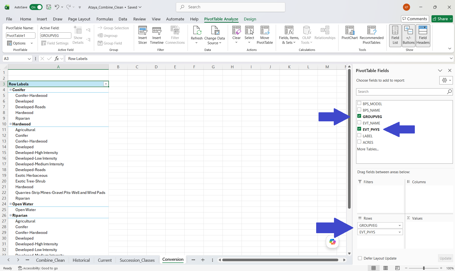
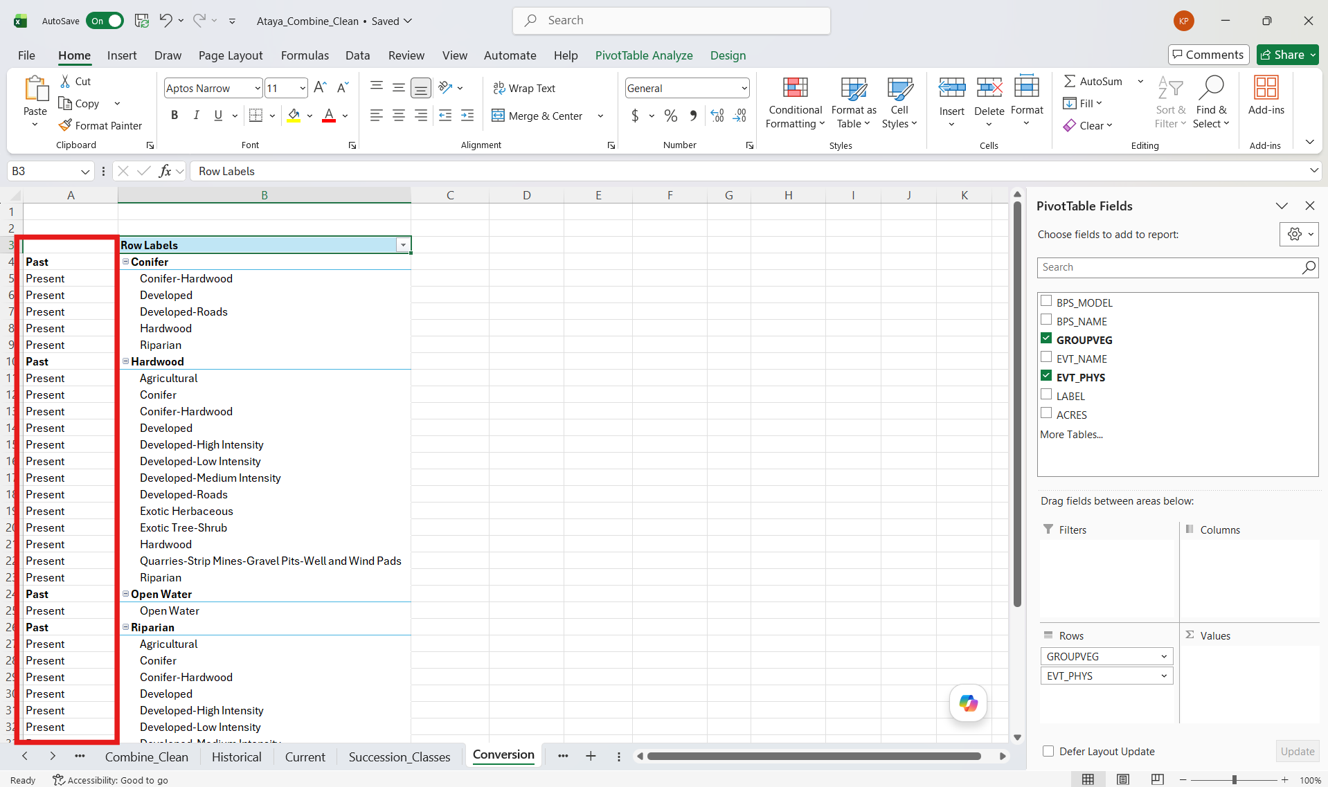
Create a new column to the left of “Row Labels”. For any bold GROUPVEG value (e.g. Conifer, Hardwood) type “Past” in bold in the cells to the left. For any normal EVT_PHYS value (e.g. Conifer-Hardwood, Developed) type “Present” in the cells to the left.
If you fancy, click the dropdown in the “GROUPVEG” header. Here you can remove different types of “GROUPVEG”.
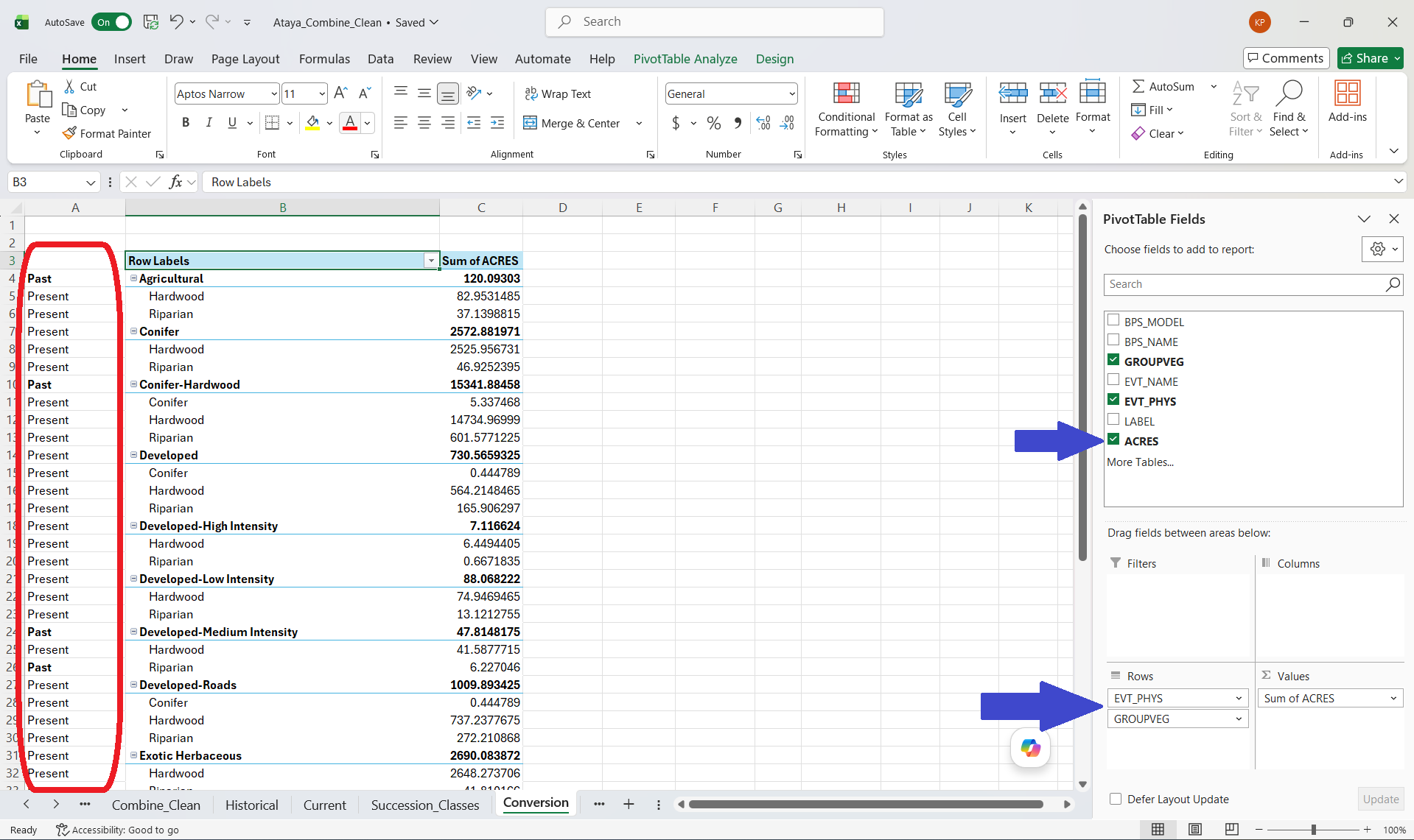
Check the “ACRES” field to add it to the Pivot Table.
Explore. Of what was historically mapped as CONIFER, what’s the biggest non-CONIFER type today?
Switch the order of the fields by dragging “EVT_PHYS” to the top of the Rows pane. Which GROUPVEG type was most converted to “Developed”? Note that our leftmost column—where we labeled “Past” and “Present”—is now switched around. If we switch the GROUPVEG and EVT_PHYS order, make sure we change the “Past” and “Present” values to avoid confusion.
We can easily make excel charts and bar graphs to summarize these findings and demonstrate change from historic conditions. We can also dive a little bit deeper to generate a table that illustrates percent change from historic ecosystem conditions to current ecosystem conditions.
8.4 Excel Steps for Preparing an Ecosystem Conversion Table
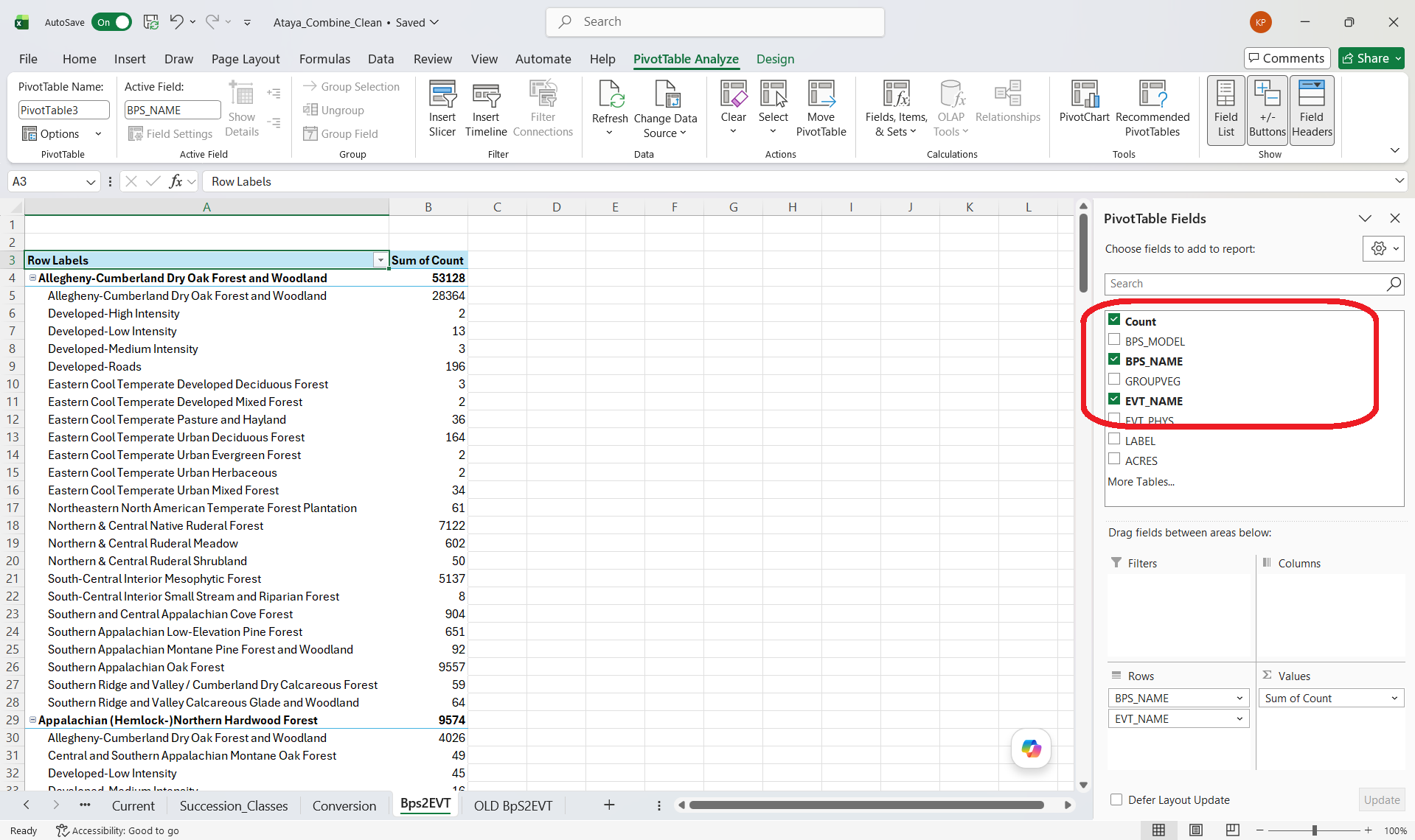
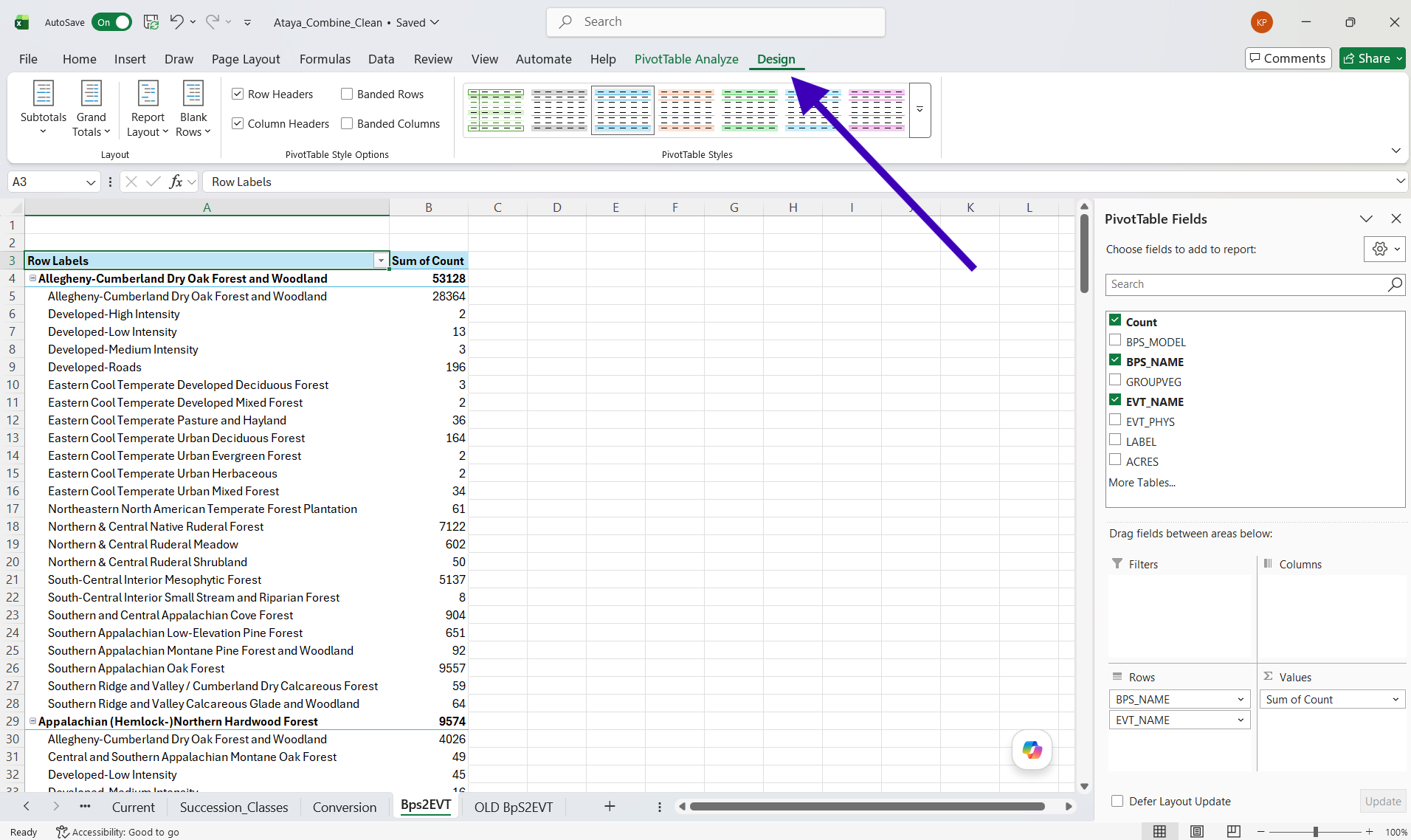
When you open up the BpS2EVT worksheet, BPS_NAME, EVT_NAME, and Acres were already selected and it appeared an analysis was completed. I suggest we create a fresh pivot table where fields are empty. It did not appear that “COUNT” was selected.
Here are steps to create a table summary which will allow us to view percent change of historical ecosystems (Bps) into current ecosystems (EVT):
Open the “Bps2evt” worksheet
In the Pivot Table, check “BPS_Name”, “EVT_Name”, and “COUNT”
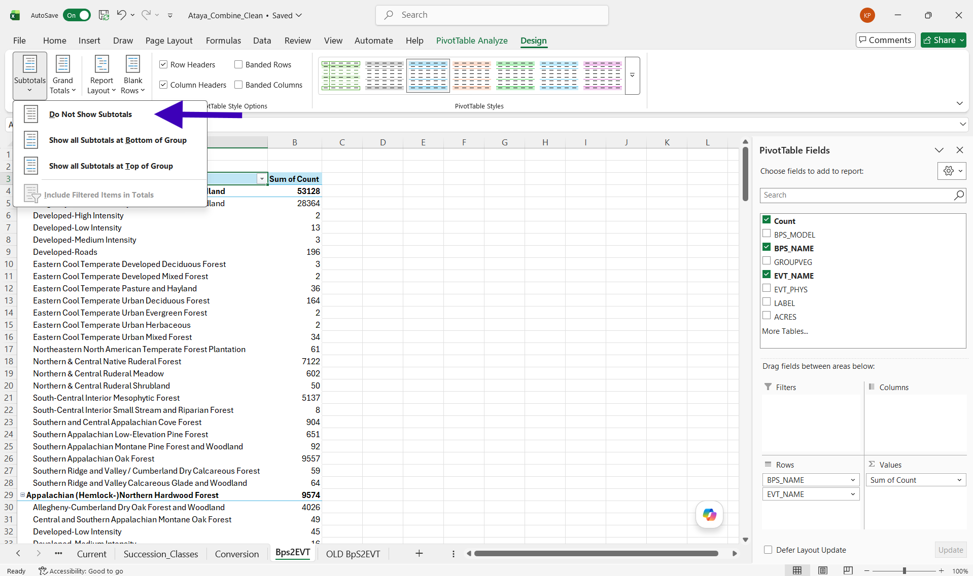
In the Main Ribbon of the worksheet (where File, Home, Insert, etc. are located) navigate all the way to the last Tab on the right labeled “Design”. Click on “Design”.
In the “Subtotals” tab, click on the down arrow and navigate to “Do Not Show Subtotals”. Click on this option.
In the “Grand Totals” tab, click on the down arrow and navigate to “Turn Off for Rows and Columns”. Click on this option.
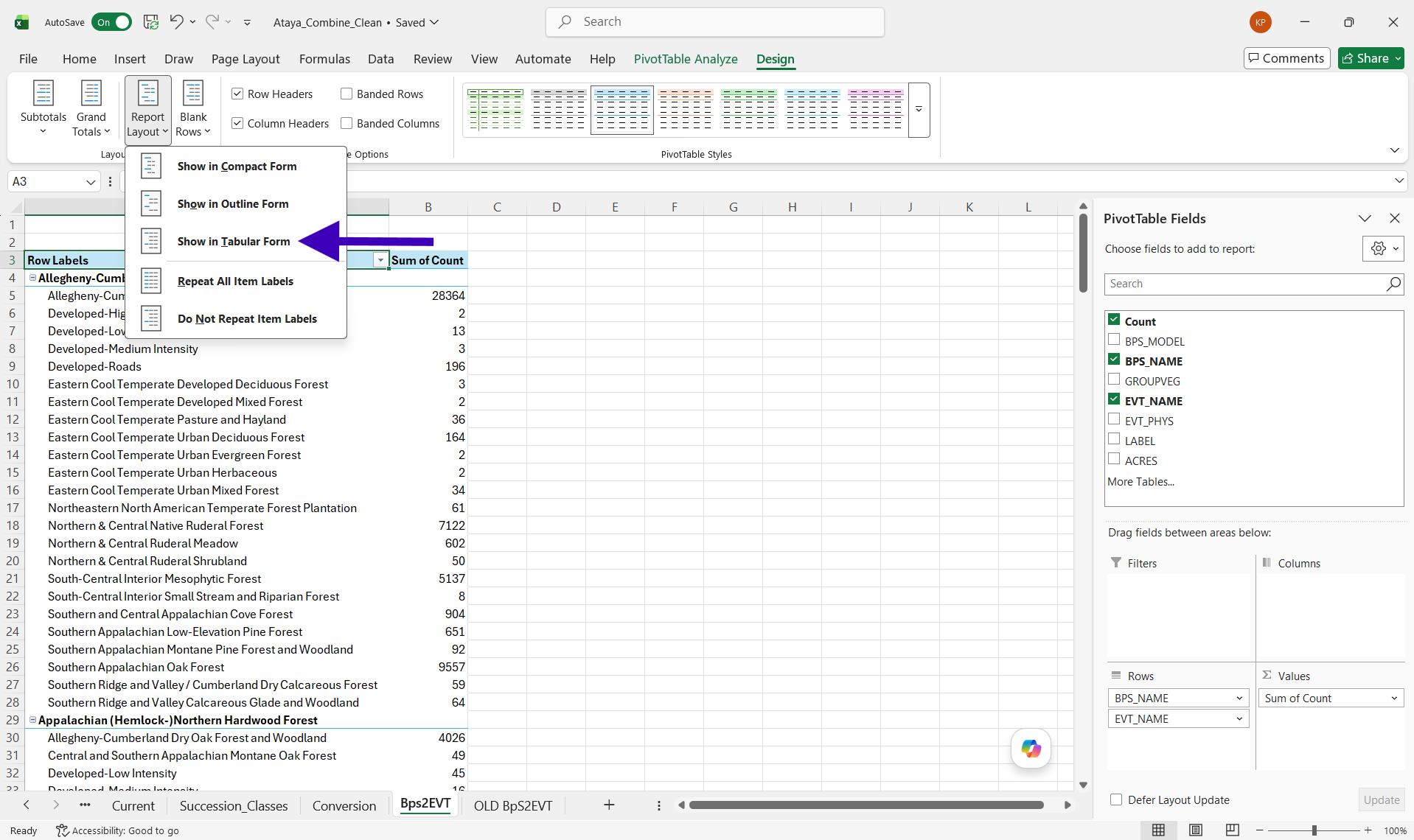
In the “Report Layout” tab, click on the down arrow and navigate to “Show In Tabular Form”. Click on this option.
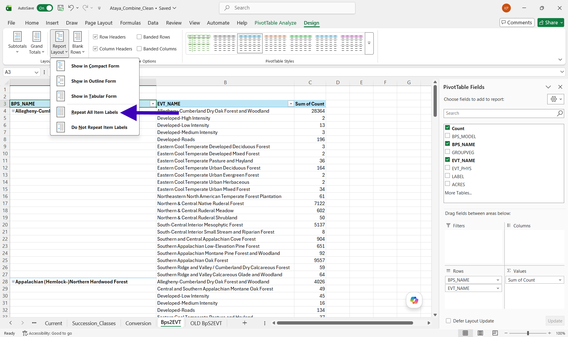
In the “Report Layout” tab, click on the down arrow and navigate to “Repeat All Item Labels”. Click on this option.
In the top data cell for the “BPS_Name” data column, right click and navigate to “Filter”. Click on “Top 10…”
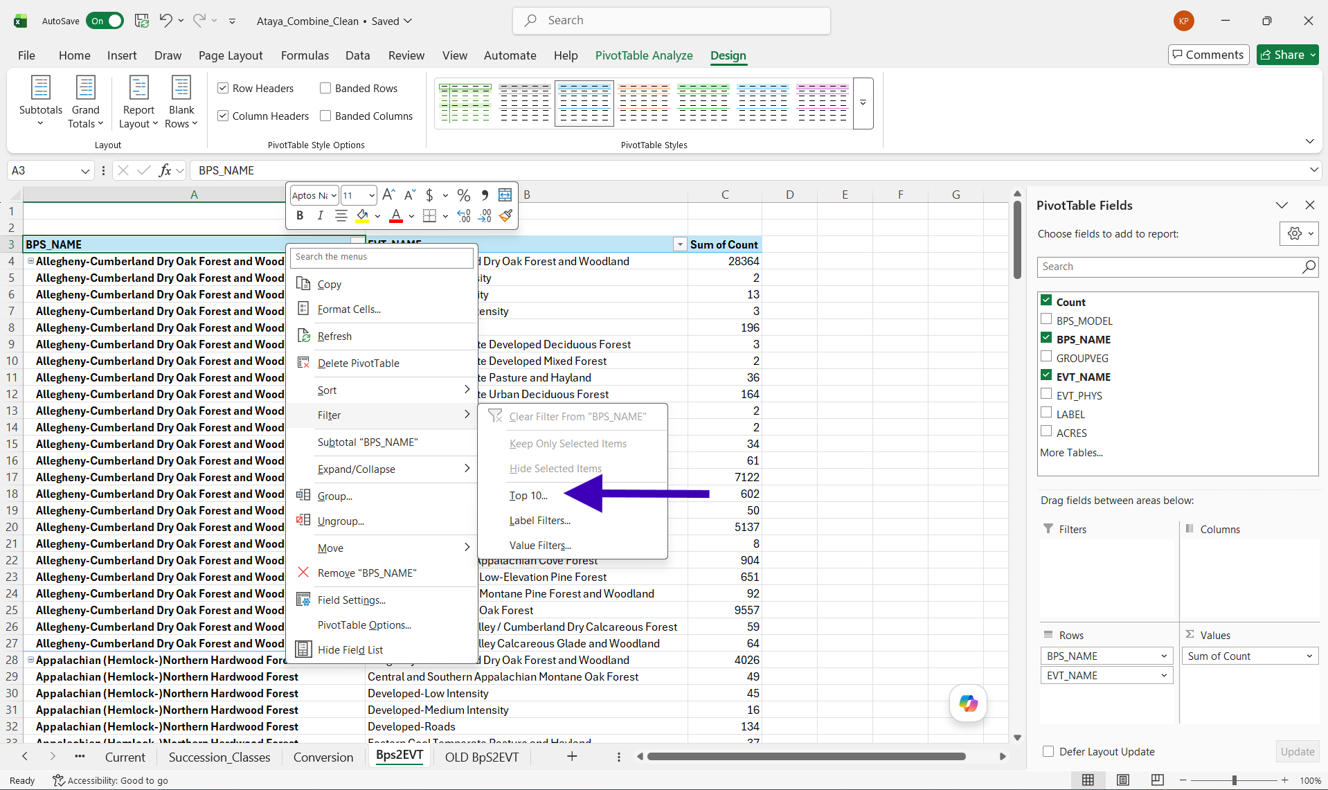
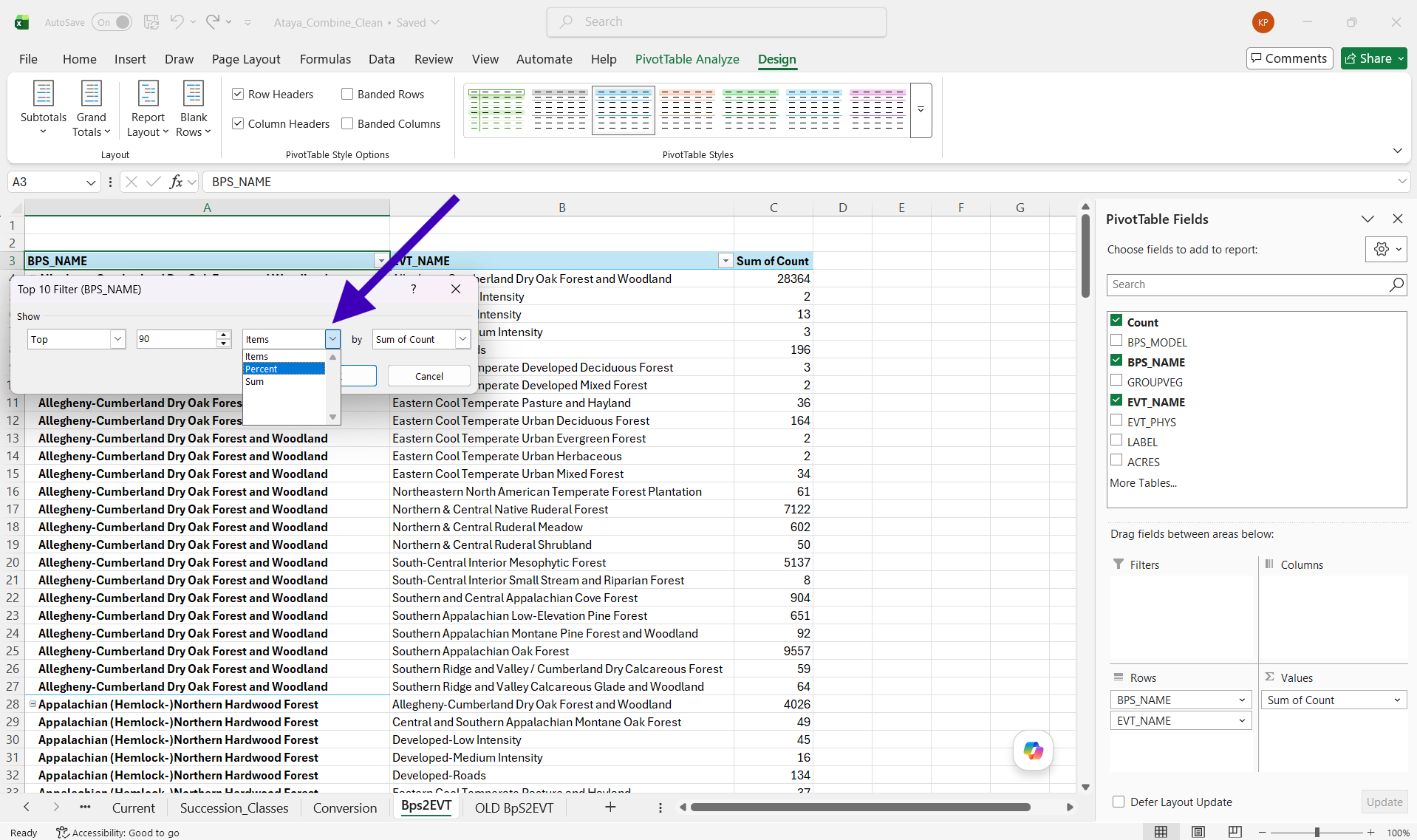
In the box that opens, change “10” to 90 and “Items” to “Percent”.
This will select the top 90% of BpS settings in the Ataya Study Area. To display all BpS, we would type in 100.
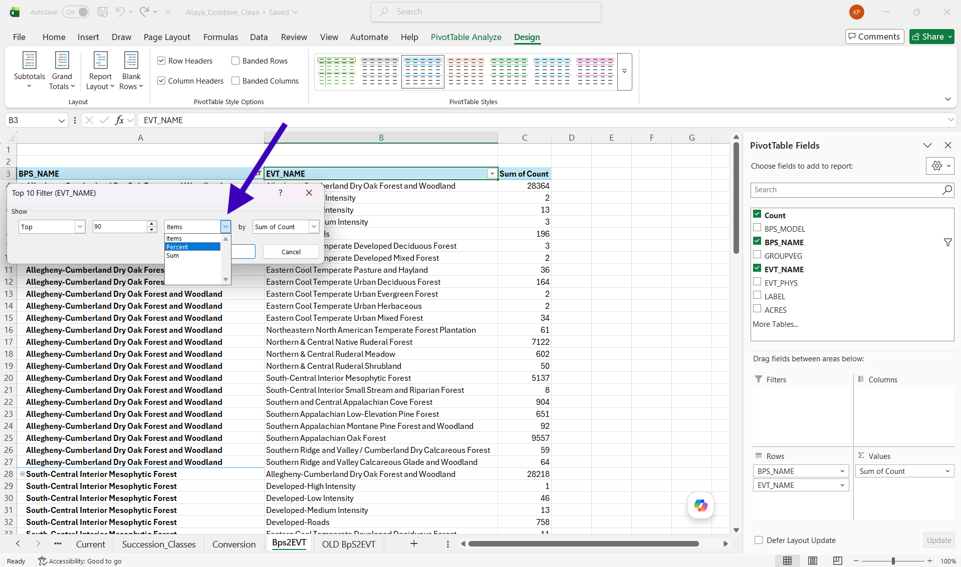
In the top data cell for the “EVT_Name” data column, right click and navigate to “Filter”. Click on “Top 10…”
In the box that opens, change “10” to 90 and “Items” to “Percent”.
This will select the top 90% of EVT settings in the Ataya Study Area. To display all EVTs, we would type in 100.
In the “Sum of Count” data column, right click on the top cell and navigate to “Value Field Settings”.
In “Value Field Settings”, click on “Show Values As” and navigate to “% of Parent Row total” and click.
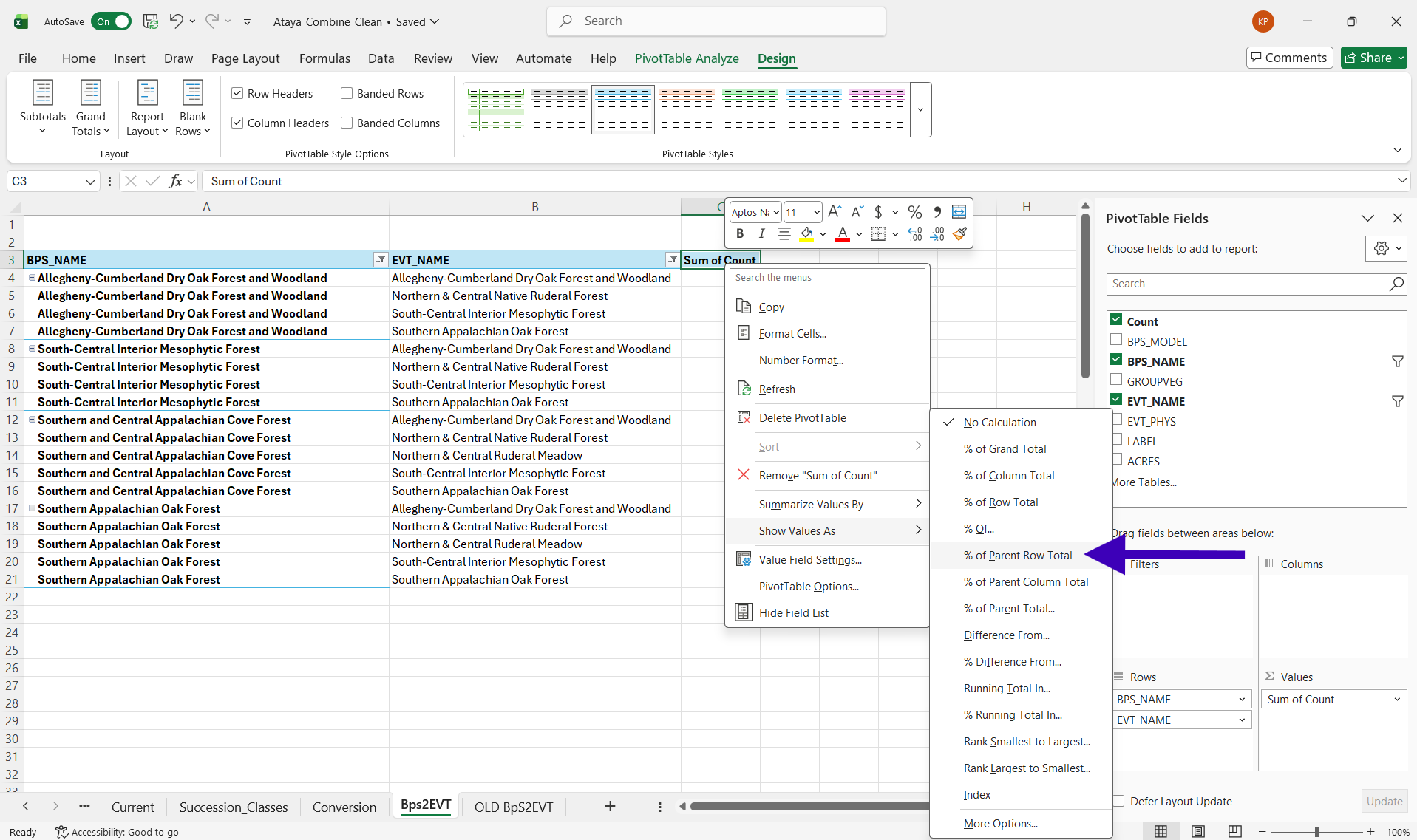
Change the name of “Sum of Count” to “Percent”.
Voila! We now have a table which should look similar to what’s below. For this tutorial, we have rounded our percents and are only displaying a portion of the table for better website viewing.
8.5 Interpreting the Ecosystem Conversion Table
This table gives us a general idea of the percent change from historic ecosystems into current ecosystems. In our table above, we see that 57% of historic Allegheny-Cumberland Dry Oak Forest/Woodland has remained as this ecosystem type within Ataya. We also see that 14% of Allegheny-Cumberland Dry Oak Forest/Woodland has converted into Northern & Central Ruderal Forest (a forest type marked by “weedy” generalist species). Additionally, 29% of South-Central Interior Mesophytic Forest has converted into Alleghany-Cumberland Dry Oak Forest/Woodland.
Here is a potential ecological interpretation for the Ecosystem Conversion Table results of our Study Area (partially based on the table and partially based on local knowledge):
- There is far more Allegheny Dry Oak Forest and Northern/Central Native Ruderal Forest mapped today than historically. Additionally, Southern Appalachian Cove and South-Central Interior Mesophytic Forests have greatly decreased over time. This could be due to a legacy of extensive ecosystem disturbance on the landscape. For example, we know that extensive clear-cut logging occurred all throughout the Appalachians in the late 19th and early 20th centuries. After these cut-over events, extensive wildfires erupted across the region due to the residual logging slash. These wildfires also spawned US Forest Service fire suppression policies in the early 20th century which altered ecosystem disturbances further.
- One hypothesis would be that due to homogeneous logging and wildfire disturbance across large landscape contexts, favorable conditions to shade-intolerant oak species (i.e. high light levels, open canopies, reduced duff layers) resulted in a massive increase in oak recruitment. As the forests grew back, oak became a far more common tree species and influenced the development of forest types away from maples, tulip-poplars, and other more shade-tolerant trees- typical dominants of Southern Appalachian Cover and South-Central Interior Mesophytic Forests. Additionally, as American chestnuts were lost due to chestnut blight in the early 20th century, oaks most likely took their place.
We can also dive EVEN FURTHER by visualizing these ecosystem changes…
8.6 Visual Exploration with a Sankey Diagram
Sometimes patterns emerge more explicitly from visuals. Below is a Sankey Diagram generated in R (which can also be created in Excel we hear. See instructions here). We used the data from our Conversion Table above to create this R figure. On the left are the historical ecosystems, on the right current ecosystems and flow bands. The width of the bands is proportional to the flow rate.